On the Colour Couch with Paint Creator Annie Sloan
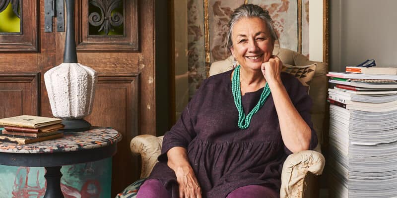
Annie Sloan paints have been around as long as I can remember. Walk into a boutique homewares or paint store and it’s likely you’ll see her paints there. She has long been on my list of colour lovers to interview, so when I found out that my friend, interior stylist Lucy Gough was friends with her I asked for an introduction and to my delight Annie agreed to be featured On The Colour Couch.
Annie and I chatted about Australia as we are both originally from there and our love of travelling before we settled in to discuss colour. You’ll notice there are some additional questions to the ones I usually ask. I put a call out to my colour students and social media community to see what they wanted to know and you’ll see I’ve included a few of their questions. I hope you enjoy reading Annie’s colourful stories and journey as much as I enjoyed chatting to her.
What is your earliest colour memory?
Oh, what a wonderful question. Nobody has ever asked me that. I was about 5 years old and I remember asking my father, who was very interested in painting and art, what his favourite colour was and he said green and me thinking my father was ridiculous to like green because I thought it was so dull. But I was intrigued and it has kept me looking at greens for a long time, well, I think forever. Now I think green is actually quite a sophisticated colour as there are so many greens.
My father had lots of Gauguin prints around the house and what I remember being hit by more than anything were the strong colours he used – oranges, purples, yellows and red.
What does colour mean to you?
Colour is a little bit like music in that it has different tones and different timbres. Colours are like a musical scale and, like music, you can’t just have one tone, you’ve got to have lots. That’s how you get multiple colours working together.
Do you have a favourite colour or a colour that you find yourself constantly drawn to and why?
It changes all the time. I think it’s about combinations of colour more than anything. I absolutely love certain blues and browns together – I think they are just magical. I don’t just mean chocolate brown, but all the beige tones. It can be almost any combination of blue or brown. I also love greens and blues together. I think you can almost have any green and blue get working together.
I think greens are incredible as there is a complexity to them as the colour range goes from an olive/khaki to a lime green to a turquoise green. There are so many different greens. I haven’t got to the bottom of them, and I think that’s why I find them so fascinating.
Do you have a colour that you least like? And why?
I do find certain purples very difficult, especially those cheap looking purples you got in the 1960’s when more clothes and pigments for paints were made from synthetic dyes. The colour got a little too one dimensional. There wasn’t any depth to it. It was a horrible sharp purple, and I think that’s why purple has got a bad rep.
But I do love lavender and the old violet colours. I think they’re absolutely beautiful. I love the way purples can turn into brown at one end of the scale.
What do you love most about working with colour?
I think it’s just endlessly fascinating. I don’t seem to get to the bottom of working with colour. I’m still learning about colour because there’s always something that I haven’t quite mixed or mastered or done anything with.
There’s always something to experiment with or somewhere else to go. I want to explore taking purples into browns, or browns into purples. I’d love to do more things with clashing colours – those colours that shouldn’t go together but do. I think, for instance, a bright pink and a red together can look just amazing. I make notes in a book of things I want to do with colour, and that’s on my list.
What do you think your life would be like without colour?
I really can’t imagine it. I suppose what I would have done if I was say, colour blind, I probably would have gone into something like music. Life would be very sad without colour.
Were you ever afraid or wary of colour? And what did you do to overcome this?
I trained at art school and when you start to paint something, you can choose any colours you like. I found then that colour was incredibly frightening.
There is a quote by Picasso where he said he was petrified of colour. He had a period where he only used very little colour because he was scared of it. He was famous for his Pink and his Blue Periods when he only used one colour at a time.
I didn’t quite do that, but I did take heart from what he said. If Picasso was afraid of colour, then it was alright for me to be scared of colour.
So, as an art student, what I did was to use terrible colours together to help me understand why some colours didn’t work together and others did. I was working in strong contrasts and some awful mixes, but it did teach me a huge amount about working with colour. I was pushing myself in all areas and not trying to play it safe.
Do you have a favourite colourful place that you visit (or have visited)?
Of all the places in the world I think India was probably the most extraordinary because of the use of colour. It is an amazing country. There is just so much clashing of colours – on the saris, but also just everywhere, there was just so much colour.
I remember being in a car going through a village and we had to stop because there were so many brightly painted houses – bright pink, bright orange. And then the women all came out of the houses to greet us, and they were wearing wonderful saris – in pinks, oranges and greens. It was a really incredible sight for the eyes.
But then you have beautiful colours in Italy and France too and I just love the colours in Sweden.
For anyone afraid of colour what would your number 1 piece of advice be?
Besides the obvious piece of advice of saying just give it a go, I would say that look at how dull pictures and artwork look when you hang them on a plain white wall. That’s why art galleries like the National Gallery in London have strong coloured walls. It is because against a white wall they are going the painting flattens out and gets lost. At home, I have a strong colour on my walls and it makes my prints and artwork look absolutely amazing.
So paint a wall and display your artwork. This doesn’t have to be expensive. I’ve collected artwork over many years going to car boot sales, looking on eBay or you can make your own pictures and frame them. Something as simple as finding three feathers on the street and framing them can look fantastic.
How did you hit upon the idea and why of all the types of paints did you go for Chalk Paint?
Before I invented it, there wasn’t anything like Chalk Paint. When I made Chalk Paint in 1990, I wasn’t thinking about inventing a paint – I had just started painting furniture and I was doing a lot of research on paint and pigments. I’m quite nerdy about studying and researching topics.
After finishing my fine arts degree, I got interested in painted furniture and wondering who did it, and why did they do it, what did they use? I looked at Swedish painted furniture, early American painted furniture and other painted furniture from around the world. It was very difficult because there wasn’t much written about it.
I was in Utrecht, in The Netherlands, doing a workshop on painted furniture, using all the wrong paints, but trying to mix them and make them work. Someone there said I should make my own paint and he knew a paint factory in Belgium who could do it for me. They were interested in helping me create a paint. I knew exactly what I wanted it to be and what I wanted it to do and that’s how I got started.
That was in 1989 and my first paint range came out in the spring of 1990. First I called it furniture paint, but I didn’t think that was a good name so I decided to call it Chalk Paint because the feel of chalk is very soft just like my paint. In hindsight, as all paint has chalk in it so I shouldn’t have called it Chalk Paint as I can’t register it as a trademark. So now other brands have their own chalk paint, but actually, I invented it in 1990.
I now have my own factory in Oxford, England where I make my Chalk Paint. As I’m based here it really helps with quality control and colour consistency.
When you’re creating colours for your range, how do you settle on the right one? Is it an instinctive decision, accidental, or is it calculated?
It will just be a desire in myself to have a new colour. When I started in 1990, one of the most popular colours was one called Primer Red, which is a sort of a brownish red. Anything terracotta was incredibly popular, but by 2010 it was probably my least popular colour, but now it is coming back again. There’s a whole move towards terracotta colours again.
Things are always changing. I suddenly will think ‘oh my goodness, I really want to use such and such a colour’. A few years back I brought out my Capri Pink – a bright pink. I just felt the need for it. And I thought, if I want it, other people will want it too. I trust that thing in the air rather than making a colour because I think it will make money. If I thought that, it just wouldn’t work, but if it is a colour that I just feel the need for, it works. And Capri Pink is one of our top selling colours.
Do you do a colour of the year or trend colours?
I think they are ridiculous. What does it mean? I don’t understand it. I don’t really feel the need for it. We are sold all over the world and so I just don’t think there is one global trend for a colour.
Do you have a favourite item that you like to paint?
I like to paint lots of things, but I do really like painting little bureaus (writing desks) because you’ve got plenty of surface to paint on and you can do so many lovely things with them. But they’re few and far between. They look great in a house because you can put all your computer equipment in them, shut the door and there are no untidy cables to run the look of a room.
Which colourful person do you most admire, and would like me to interview on The Colour Couch?
Kit Kemp. I love her style. I love her. Her hotels are amazing. I’ve created some bespoke colours for her, for her new American hotel – a bright orange and a bright blue.
I just love Annie’s story and her journey that lead her to create her colourful paints. That just goes to show to not give up, even if you’re not sure what it is or even if it doesn’t exist yet. Stay curious, keep experimenting, stay focused and believe in yourself. Like Annie, it might take you in an unexpected direction which is right where you’re meant to be.
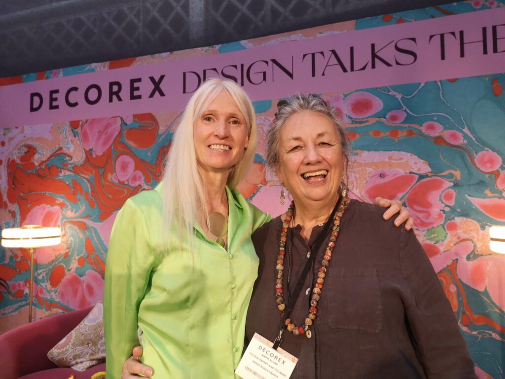
As it just so happened Annie and I were both at Decorex London yesterday on separate panel discussions so it was the perfect opportunity to met in person.
If you would like to discover more about Annie Sloan, head over to her Instagram @anniesloanhome.
Wishing you a colourful day,
Karenx
You can catch up on Lucy Gough’s Colour Couch interview is over here.
You can find out more about Decorex over here.

SIGN UP FOR MY NEWSLETTER
Get a Free Chapter from The Little Book of Colour
© Karen Haller
Designed by cptcreative.com