On the Colour Couch with painter & decorator, Ashley Aspin
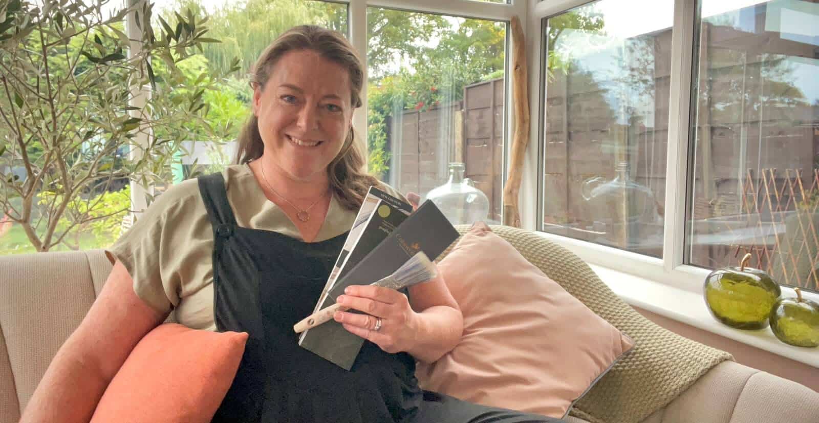
This time on The Colour Couch, I’m joined by Ashley Aspin, an Interior Decorator and Colour Consultant whose expertise has also earned her membership of the Guild of Master Craftsmen.
Ashley and I have known each other since 2020, when she bought a copy of The Little Book of Colour. That led her to study with me and eventually join my Advanced Colour & Design Mentoring Programme, which she loved so much she did it twice!
Since then, our relationship has grown from student and mentor to fellow colour professionals and friends. We’ve shared many conversations about colour over the years, so it feels particularly special to now have Ashley joining me on The Colour Couch.
As both a Colour Consultant and skilled decorator, Ashley works with colour from both a psychological and practical perspective, and as you’ll discover, her own relationship with colour is a fascinating one.
Over to Ashley to find out more…
What is your earliest colour memory?
As a child, I had an apparently endless supply of paper that my Dad brought home from work. We called it computer paper, and it was large, wide, continuous sheets of thin paper, perforated between each page and down both sides, with those little holes along the edges that fed it through the printer.
One side had thin green and white stripes on which was printed an unfathomable code of letters and numbers, presumably computer, which was of no interest to me. But the other side was my blank canvas, and I went through sheet after sheet of it. I had a whole heap of Lakeland coloured pencils, and Crayola crayons too, with colour names printed on their little paper wrappers.
There were all the basic colour names such as red and orange as you would expect, but the ones that caught my imagination were ones like Red Orange and Orange Red; Blue Violet and Violet Blue. I was fascinated that they were different colours. Creating was what I did. I would play shops and go into immense detail drawing and making things for my shop counter.
I had a pot of Copydex glue, with a little brush in the lid that smelled of ammonia and went through reels of Sellotape. I had an Usborne book of things to make from paper and card. I remember a Chinese dragon on the cover and a section called Paperville, and I made the whole village. So you could argue that not much has changed…!
What does colour mean to you?
I’m one of those people who has near constant commentary mumbling away in my brain and colour gives it plenty to work with. I notice colour anywhere and everywhere. I can be stirring a new tin of paint, wonder why a pigment was once so expensive and end up reading about trade routes and history.
Wet pavements hold a particular fascination with light and reflection. I might see a combination of colours in nature and wonder about putting them together in an interior scheme. One thing leads to another, and another, and another!
That’s what I love about colour. It’s right in front of me every single day and there is always a story hidden in plain sight. I can never know enough about it because there is always another question.
I feel incredibly lucky that colour is both my profession and a subject that has grabbed me by the scruff of the neck more than any other. I am never bored by it and the more I discover, the more there seems to be to discover.
Which, for a brain like mine, is probably why it suits me so well!
Colour has always felt instinctive and one of the most significant moments in understanding that came when I was about eleven. I was chatting to my violin teacher about colour and music and mentioned, amongst other things, that Saturday was yellow and Friday was chocolate brown. She realised from the way I was talking that I probably had synaesthesia.
It wasn’t until years later that I learnt more about synaesthesia and discovered that I experience several forms of it. Professor Julia Simner’s work has been particularly interesting to me in understanding this. More importantly, it helped me recognise that the way I experience the world isn’t necessarily the way somebody else experiences it. We can look at the same colour, hear the same sound or inhabit the same space and have quite different responses to it. I think that understanding sits somewhere underneath the way I work with colour now.
Do you have a favourite colour or a colour that you find yourself constantly drawn to? And why?
I do. A very particular terracotta. Less reddish-brown than a new terracotta plant pot, and slightly cooler and paler. More like an old pot that’s been sitting in a greenhouse for years and has faded and developed that pale, weathered surface they get. That kind of colour. It’s surprisingly hard to find, so when I do come across it, I tend to buy things in it because I never quite know when I’m going to see it again.
I have a waffle blanket on my bed in this colour and it’s genuinely one of my favourite things. There’s something about that colour that has a gentle energy for me. I find it incredibly comforting and reassuring. It just feels like home, and the most “me” colour.
Do you have a colour that you least like? And why?
Citrine. And rather oddly, my reason for choosing it is as much about taste and texture as it is about colour.
Synaesthesia means that some of my senses and associations overlap in ways they don’t for everybody. I’ve always experienced certain colours, words, days of the week and other things with additional associations. I don’t consciously decide what they should be. Saturday, for example, has always been sunshine yellow to me and Friday is chocolate brown.
But with Citrine, that limey yellow-green, I experience two additional sensory responses which I can only describe as a combination of a soft, slightly grainy texture like an overripe pear, and a taste sensation akin to biting into a kiwi fruit. I’m aware it sounds very weird!
It’s most noticeable when I see the colour in isolation, or even when I think about it. It isn’t overwhelming, it’s just there, and has been for as long as I can remember.
But what I have found so interesting is that context can change things. There are a few plants in my garden that are almost exactly this colour, like Alchemilla Mollis, and I really like their brightness against all the other greens,
What do you love most about working with colour?
It’s different every single time. No two people I work with ever choose the same scheme, because really, when I’m working with colour, I’m working with people.
More than a few clients have become emotional during our first appointment, and it can take them by surprise. They think we’re going to talk about paint colours from the get-go, and then suddenly they realise how much they’ve been holding on to.
There might be memories attached to the house, somebody else’s opinions they’ve been carrying around for years, a fear of getting things wrong, or simply the feeling that they don’t trust themselves to make the decision. It looks like choosing a colour, but sometimes the process uncovers something much bigger that has been getting in the way.
I had one client who had lost her husband, and she was so hesitant about making decisions about a home that had once been theirs and was now hers. We took our time, and gradually I watched her begin to trust her own responses.
By our final appointment she was like a different person. She knew what she wanted, she was happily living with colours she loved, and she absolutely owned her decisions. I wrote down what she said when I got home. She said, “My family have houses full of colour, but I can do colour too, and my house has lovely colour in it.” Isn’t that wonderful?
That’s what I love about working with colour. Those shifts can be so palpable. You can almost see the moment something clicks and suddenly they’re off. I may have arrived to talk about colour, but it’s the people, and what can happen when they begin to trust themselves, that I love most.
What do you think your life would be like without colour?
Like losing a limb?! At face value, I think life would be less enjoyable, but not unliveable. I know I would miss the pleasure I get from colour, so for example I’d really miss autumn, and Christmas would feel pretty odd. It would be a bit like losing my sense of taste. I could still eat, but an enormous part of the enjoyment would have disappeared, and I’d be irritated by that. It would be like a bad dream, when something won’t stop and you just want to wake up to normality.
I suppose I’m imagining that my world would be black and white, although if sepia is an option, I’ll have that please. And thank goodness there would still be light and shade, shape, texture, pattern and sheen.
My vision is already compromised by severe short-sightedness. My sight deteriorated rapidly as a child, so I can’t remember what it’s like to wake up and be able to see clearly. It’s my normal and I just get on with it, so I imagine eventually I’d accept the situation. For what it’s worth I’d far rather keep my blurry colour vision than swap it for 20/20 in monochrome.
But I know exactly what action I’d take, because I enjoy finding ways to use a difficulty. I’d look to develop another of my senses in depth, so maybe I’d train to become a perfumer, or a professional taster of chocolate or coffee. I could live with that!
Professionally it’s horrifying to contemplate. If I lost not only colour vision but also my ability to visualise colour, how on earth could I do my job? So much of what I do depends on being able to look at a room and “see” colours that aren’t there yet, and imagine how they might work together.
Although the more I think about it, the more I realise that taking colour out of my world might not take colour out of me. Thursday would still be dark green. Saturday would still be sunshine yellow, and that would bring me great comfort.
What’s your favourite colour story?
In May 2005 I placed my wedding bouquet order over the phone because we were getting married some distance from where we lived. I remember telling the florist I’d like yellows, deep pinks and purples. She suggested roses and that was pretty much the end of the conversation.
In my head, however, the yellow was deep, bordering on orange. I was imagining purple freesias and carmine pink roses and green foliage but apparently didn’t think any of that was worth mentioning. I just assumed the florist would somehow see what I could see in my head.
In fairness she created a beautiful bouquet. But the yellow was so pale as to be cream, my deep pink was crimson and my purples had become a delphinium blue. For a moment I wondered out loud if they had delivered the wrong order. So, as it was, I walked up the aisle carrying what looked to me remarkably like a floral Union Jack.
My husband’s pale pink buttonhole bore no relation to anything I was holding. So, it turned out to be my first real lesson in how differently we interpret colour. I thought I’d been quite specific. I really had not!
Do you have a favourite colourful place that you visit (or have visited)?
Without hesitation, Monet’s House and Garden in Giverny
I visited in August 2024, when the garden was in full bloom and an absolute riot of colour. We got there super early and it was worth it, as it can get so crowded.
The garden was buzzing with life and texture and beautiful sightlines but walking into the house I got goosebumps. The colours, the light, the rooms, the views out into the garden. The yellow dining room, the green window frames, the in-between rooms given as much attention as the main rooms.
I don’t know how long I stood in the kitchen looking at it’s extraordinary ceiling with the light bouncing off it and the shiny copper pans reflected in its surface.
The undulating glossy light blueness of it made me think of an upside-down swimming pool. Truly mesmerising. I’m still quite obsessed with it and think about it a lot.
Being in these rooms where Monet lived, experiencing the colours he surrounded himself with, being in that light that he stood in gave me something I’d never got from standing in front of one of his paintings. Which sounds ridiculous when his work is so famous, but I remember thinking how much better I felt I understood him as an artist for having been there.
My family say I was noticeably quiet for the rest of the day, which probably says everything you need to know, actually.
If you could pick any colour and give it a name, what would that be?
I would take my favourite terracotta and call it Potting Shed, because that’s probably my strongest connection with the colour itself.
My grandparents had an old outbuilding where they kept the lawnmowers and all their garden tools. It was dark and smelled of metal and oil and grass cuttings. Built onto the side was a lean-to greenhouse filled with pink and red geraniums and rows of pots and seedlings.
They loved their tomatoes and something they called seakale beet, (which I think is chard) and the garden had lots of fruit and nut trees. My grandpa made sloe gin and elderflower wine from what grew there too.
I loved helping them in the garden when I stayed, picking whatever was ready. There’s something about terracotta that takes me straight back there: earth, plant pots, old buildings, growing things and getting your hands dirty.
So I think it would have to be Potting Shed.
Were you ever afraid or wary of colour or afraid of colour? And what did you do to overcome this?
This is such a great question, because I think there’s a difference between being afraid of colour and being wary of it.
I’m not afraid of colour. If anything, I’m drawn towards it. I want to look at it, play with it, notice what it’s doing and understand why one colour works so brilliantly beside another. But can I be wary of it? Of course. I’m human, and colour affects me just as it affects everybody else.
Highly saturated colours can make me want to retreat from them. Cobalt or electric blue, for example, is a colour I can admire, but one I find so visually loud and demanding that a little goes a very long way. For me it’s like walking into a room where the music is a bit too loud and you can’t hear yourself think. But if I catch a flash of brilliant blue on a riverbank, I’m beside myself with excitement. So, as ever, it comes back to context.
I can thoroughly enjoy looking at an interior full of strong, saturated colour, but I have a time limit. I need somewhere for my eyes to rest. I’ve always been something of a daydreamer (my school reports back this up) and I’m happiest in spaces where I can just sit and stare for a while. There are plenty of colours in my own home, but they tend to be soft and muted: dusty pink, lavender, sage green and cool oranges, when I can find them.
That said, l do love a hit of seasonal colour. The pastels that appear around Easter, the pumpkins and glorious oranges of autumn and Halloween, and then all the extra colour that comes into the house at Christmas. That’s what “dopamine decor” means to me. I revel in it while it’s there, but by January I am absolutely itching to pack Christmas away and reset the house again.
Colour has always felt very natural to me. I was lucky to have some brilliant art teachers at school, so looking at colour, mixing it and experimenting with it started early. That fascination with art never really left me and I still love wandering around a gallery and seeing what other people have done with colour.
I don’t think being confident with colour means you have to want lots of highly saturated colour around you. Some of the uses of colour I find most exciting in art are incredibly restrained. One colour in exactly the right place can be far more interesting to me than throwing the whole paintbox at something.
For anyone afraid of colour what would your number 1 piece of advice be?
In terms of decorating, I think my first piece of advice would be to ask yourself what you’re actually afraid of. Is it what somebody else might think? That you’ll get it wrong? That it will be too much, too dark, too bright? And if that’s the fear, keep going. Too much for whom?
Sometimes we accept these ideas about colour without ever really questioning where they came from.
For a lot of people, there is an imaginary (and it has to be said, mostly uninvited) audience in the room. What will the neighbours think? Will people think I’ve got terrible taste? How will I sell it? What if everyone hates it? The trouble is, you can’t control what other people think anyway. Once you really accept that, I think some of the fear begins to lose its grip.
You can make a safe choice and spend years living with it, knowing it isn’t really enough for you. Or you can make the choice that feels a little harder at the time because it asks you to trust your own response, but the outcome can be transformational.
And if I may, my second piece of advice would be to go for a walk. Get out of your home and go, anywhere! It could be a walk in the countryside, through a city, around a garden or down your local high street. Just get away from the room you’re trying to make decisions about and start noticing colour elsewhere.
What grabs your eye? What makes you stop and look again? Which combinations do you keep noticing? Don’t worry about whether any of it would work on your walls. You’re simply beginning to notice what you respond to when there isn’t a decision attached to it.
We look at our homes differently when we have had a break from them, and a walk outside is sometimes enough.
I think that’s where confidence with colour starts. Not with suddenly becoming fearless, or knowing all the rules, but with getting better at noticing your own response and learning to trust it.
Which colourful person do you most admire and would love me to interview for the On the Colour Couch series?
I couldn’t choose just one! Joa Studholme of Farrow & Ball, Victoria Yardley of Victory Colours, or maybe Stuart Semple, who created the world’s pinkest pink.
I’d love to hear about their own personal relationships with colour, where those began and how they’ve changed over time.
My takeaways from Ashley’s colour conversation
Having had so many conversations about colour with Ashley over the years, I loved hearing more about her own personal relationship with it.
What makes Ashley’s relationship with colour particularly fascinating is the way she experiences it. Her synaesthesia means colour can be connected with other sensory experiences, from days of the week having their own colours to citrine bringing with it a very particular taste and texture. And yet, as Ashley’s answer about her wedding bouquet so perfectly illustrates, even when we think we’ve described a colour clearly, someone else may be seeing something quite different.
I also loved the story of her client who went from being hesitant about making colour decisions to proudly declaring, “I can do colour too.” It captures something that comes through strongly in Ashley’s work: the importance of helping people find the confidence to make colour choices that feel right for them.
And I think Ashley’s advice for anyone who feels afraid of colour is a great place to finish. Ask yourself what you’re actually afraid of, step away from the decision for a while and notice which colours naturally catch your eye when there’s no pressure to choose.
If you would like to discover more about Ashley, head over to her Instagram @ashleyaspin.
Want to meet Ashley? She’s one of the experts joining me for my Decorex Design Circle, where we’ll be discussing What Role Does Colour Play in Interior Design? To book your seat, head over here.
Wishing you a colourful day,
Karenx
Image courtesy of Ashley Aspin
SIGN UP FOR MY NEWSLETTER
Get a Free Chapter from The Little Book of Colour
© Karen Haller
Designed by cptcreative.com