On the Colour Couch with author & TV presenter Michelle Ogundehin
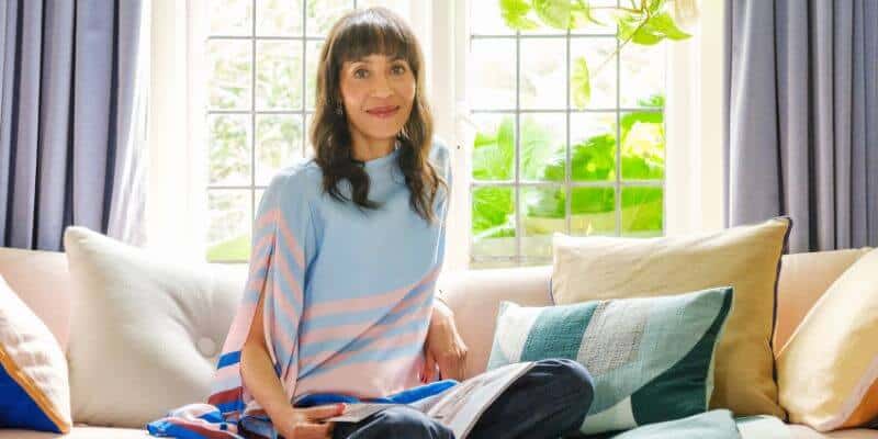
I’ve been wanting to interview Michelle Ogundehin for years, so I’m absolutely delighted she’s finally here.
Michelle is one of the most sought after names in the world of interiors, and with good reason. Having originally studied architecture, she went on to become Editor in Chief of ELLE Decoration and has since established herself as a creative consultant, author and, of course, Head Judge of BBC’s Interior Design Masters.
I first met Michelle years ago when she was chairing a panel discussion, and she’s been on my wish list of people to interview ever since. Then, a few weeks ago, our paths crossed again when we were both speaking on a panel for the Johnstone’s Trade Colour of the Year launch. Michelle told me she hadn’t forgotten my invitation, and here we are!
So, let’s find out more about Michelle’s personal relationship with colour, how her own colour choices have evolved over the years and what she really thinks about colour trends…
What is your earliest colour memory?
This one I really had to think about, because I didn’t feel I had one defining colour memory. Yet I’ve always been extraordinarily sensitive to my surroundings, and particularly to the way different environments made me feel.
I think I noticed atmosphere long before I understood how it was being created. And colour is such a fundamental part of that. Certain combinations can make a space feel comforting and familiar, while others can make you feel quite unsettled. That profoundly instinctive response to my surroundings is something I’ve carried with me throughout my life.
What does colour mean to you?
Colour is one of the most powerful tools we have for changing how a space feels, and therefore how we feel within it. It’s never simply decorative. It can create warmth, intimacy, energy, or calm. It can alter our perception of a room’s proportions, draw our attention towards something or allow something else to recede.
And it carries enormous personal meaning, because our responses to colour are shaped by memory, culture, and experience. For me, colour is a language. It’s one of the ways we communicate who we are, often without saying a word.
Do you have a favourite colour or a colour that you find yourself constantly drawn to? And why?
I find myself returning again and again to what I call dirty colours, in other words colours with a healthy dollop of grey in them. Think lavender, sages, and dusty pinks. I find these very soothing. They’re difficult to pin down because they shift depending on the light and what surrounds them. They can be a little ambiguous. Not shouty, or too overt. I love colours with depth and a little ambiguity. They feel more interesting to live with to me because they reveal themselves gradually, rather than announcing themselves all at once.
I put this all into play when I developed my paint collection for Graphenstone. 16 soothing shades all deliberately designed to work together from top notes to base notes. I’m just about to paint a whole wall in my living room in my Terracotta from the collection!
Do you have a colour that you least like? And why?
Not really. I think almost any colour can be beautiful in the right context. What I dislike is when colour is used without consideration for the light, the architecture or the people who inhabit the space.
Even a colour I might initially find rather challenging can become extraordinary when it’s combined with the right materials and other shades. It’s rarely the colour itself that’s the problem. It’s what we do with it. That said, I can’t see myself ever using any purple or burgundy in my own home.
What do you love most about working with colour?
It’s transformative power. I always say paint is like make up, easy to apply, easy to change, so we should have fun with it. It’s hard sometimes to change the physical structure of a room, yet you can completely alter its atmosphere simply by changing the colour.
And I love that colour is relational. A shade never exists in isolation; it changes according to the light, the texture of the surface it’s applied to and the colours around it. There’s something endlessly fascinating about that interplay. It’s part science, part intuition, and always a little bit magical.
What do you think your life would be like without colour?
Considerably poorer! And not simply because the world would be less visually interesting. Colour is so deeply connected to our emotions and memories. Without colour, I think we’d lose an extraordinarily rich layer of how we experience and remember the world.
What’s it like being head judge of Interior Design Masters? How did you get involved?
What are your thoughts on the way colour is used, and how have you seen it evolve
over the years?
Being part of the show is an extraordinary privilege, and one I never take for granted. I love seeing the designers develop their confidence and find their own creative voice. Because ultimately, that’s what good design is about: the ability to make decisions with conviction and intention, but also to understand why you’re making them.
Colour is always fascinating on the show because it reveals so much about how a designer thinks. Some use it instinctively and brilliantly; others use it almost as a shortcut to making a statement. And those are two very different things.
Also it seems certain colour combos definitely float in and out of fashion so sometimes you feel like everyone’s working to a pre-agreed palette! What interests me most though is whether the colour is doing something meaningful. Is it creating the right atmosphere? Does it support the purpose of the space? A beautifully considered neutral scheme can be every bit as powerful as a room drenched in saturated colour. It doesn’t always have to be full fat.
What are your thoughts on colour trends?
I’ve never believed that colour should be dictated by trends. The idea that one year we should all be painting our homes green and the next we should be embracing burgundy seems rather absurd to me. Our homes are too important to be governed by such fleeting prescriptions.
That said, colour trends can be interesting as a reflection of the wider cultural mood. They can sometimes tell us something about what we’re collectively craving, whether that’s reassurance, optimism, comfort or escape. But that’s very different from suggesting that everyone should adopt them. The colours you choose for your home should reflect what you need, not what’s currently fashionable.
What’s your favourite colour story?
One of the things I find fascinating is how differently we can perceive the same colour. What looks like a warm grey to one person might look green or lavender to another, depending on the light, the surrounding colours and even our individual perception.
It’s a wonderful reminder that colour isn’t a fixed experience. It’s something we actively interpret. And I think that’s why I always encourage people to trust their own response rather than rely too heavily on somebody else’s opinion.
Do you have a favourite colourful place that you visit (or have visited)?
I have two, the Charleston House in East Sussex because of its relationship between colour, creativity and the lives of the people who inhabited it. And Leighton House in London for much the same reason but especially the Arab Hall which is a masterwork of tiles, colour, ambience, and decorative genius.
If you could pick any colour and give it a name, what would that be?
I was very pragmatic when I came to naming the colours in my Graphenstone collection. I call a spade a spade! So it’s Easy Green, Warm Sage, Dirty Sage, Palest Pink, Easy Rose, Dirty Pink, Palest Lemon and so on.
But I’d love to bottle the colour of distant mist over fields that has that romantic but very faint hazy blue/green hint to it. I think the word Mizzle is the actual definition, and that’s already been taken for a well-known paint brand, but this isn’t the colour I mean.
Were you ever afraid or wary of colour or afraid of colour? And what did you do to overcome this?
I’ve never really thought of colour as something to be afraid of. But I can definitely track my, if you will, emotional evolution, through the colours I’ve chosen to surround myself with.
As a young naiive student, Mr Happy yellow was my default for things like my duvet cover and study folders. Then I moved into clever beiges. And out the other side into a whole series of what I might term Winter Blues… ie the colours of an English sky in the winter!
When I bought my first house in Brighton, I was determined to paint an entire wall in bright turquoise, and I literally tried about 20 different sample pots, abandoning them all in the end for another clever beige.
Then, in more recent post childbirth years it’s been all about the greens, and in the home I’ve renovating at the moment, I’m really leaning into all of my pinks alongside my Easy Greens and Dirty Sages, plus the aforementioned Terracotta in the living room! I hope it speaks of increased warmth, comfort, and stability in who I am, and who I’m becoming!
For anyone afraid of colour what would your number 1 piece of advice be?
Stop worrying about getting it right and start paying attention to how it makes you feel. Before you think about paint charts or colour combinations, notice the colours you’re naturally drawn to in your clothes, in nature, in the things you collect. Those preferences are clues.
Then experiment. Live with large samples, observe them in different lights and see how you respond over time. Colour confidence doesn’t come from following rules. It comes from learning to trust your own eye.
Which colourful person do you most admire and would love me to interview for the On the Colour Couch series?
I’d love to suggest someone whose relationship with colour goes beyond aesthetics – someone who uses it as a means of expression, storytelling or challenging how we see the world. But I’m not sure who that might be! It’s rare these days.
I recently researched for a piece about Corbusier’s colours which was fascinating. Beyond the work of Luis Barragan, I can’t really think of many other architects who employ colour in their building toolbox as effectively as everything else they had to play with. It seems like a real missed opportunity!
My takeaways from Michelle’s colour conversation
I had to smile at Michelle’s journey from Mr Happy yellow in her student days, through her clever beige phase and those 20 turquoise sample pots, to the greens, pinks and terracotta she’s embracing today. I wonder how many of us can look back and recognise different chapters of our lives through the colours we chose to surround ourselves with?
What I particularly loved was Michelle’s openness about how her tastes have evolved. There’s something rather wonderful about recognising that the colours we once felt so certain about might no longer be the ones we want around us. Not because we got them wrong, but because we’re not quite the same people we were then.
I love the idea that we can look back at the colours we’ve lived with and see how they’ve changed alongside us. And that the colours we’re choosing today might tell a very different story in years to come.
Thank you, Michelle, for sharing your colourful journey with us!
If you would like to discover more about Michelle, head over to her Instagram @michelleogundehin.
You can check out Michelle’s Graphenstone paint collection over here.
And you can read Michelle’s article on French architect Le Corbusier here.
To read up on the Johnstone’s Trade Colour of the Year head over to my Instagram post.
Wishing you a colourful day,
Karenx
Image courtesy of Michelle Ogundehin.
SIGN UP FOR MY NEWSLETTER
Get a Free Chapter from The Little Book of Colour
© Karen Haller
Designed by cptcreative.com