On the Colour Couch with paint maker Edward Bulmer
One of my aims with On the Colour Couch is to speak with the people behind some of the leading paint brands to uncover the stories, ideas and philosophies that shape the colours we use.
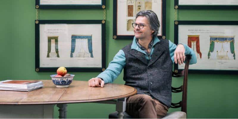
This time it’s Edward Bulmer, the designer and architectural historian behind Edward Bulmer Natural Paint.
Edward has spent his career bringing colour back to many of England’s most treasured country houses, including Chequers, Althorp, Goodwood House and Chevening. His deep respect for history and craftsmanship is evident in everything he does, whether restoring period interiors or developing paints made from natural ingredients using methods based on traditional practice.
Over to Edward on the Colour Couch to find out more…
What is your earliest colour memory?
Being asked what colour I would like my bedroom – I replied purple and David Mlinaric who was directing the painters had a deep aubergine colour mixed. Later I repainted it a colour remarkably similar to one we now offer as Invisible Green (sorry David!)
What does colour mean to you?
Joy and judgement. What you have in your room is the most important choice I feel, so setting that off – whether a treasured possession or a favourite fabric is the job of the colour you choose. So it is the primary language of a secondary function in interior design, methinks.
Do you have a favourite colour or a colour that you find yourself constantly drawn to? And why?
Most days yes. Today it is one I have been working on as part of a range launching next year – a beautiful conker brown….
Do you have a colour that you least like? And why?
I don’t love that slimy green so favoured by some designers. Maybe its because I live on a farm with fields dressed with cowpats which are the same green!
Yellow is not an easy colour to handle as it can be an awkward bed fellow for other things – fabrics and finishes, like gilding.
What do you love most about working with colour?
It’s the gift that goes on giving. Like most artists I am content with 12 pigments and by using them with a good amount of earth pigment in each recipe we get a subtle tonal uniformity through our whole range. This means that not only doe they work with each other, but they work every time!
What do you think your life would be like without colour?
Grey presumably.
What’s your favourite colour story?
We have a cheeky story behind the name Trumpington. It is a beautiful tobacco colour that I first mixed for Rita Konig.
In adding it to our range the nicotine connotations felt wrong. An amusing anecdote I heard on the radio brought me the solution…interviewed in her eighties, Baroness Trumpington was asked what she liked to do after making love? Her reply ‘light up a cigar’.
Were you ever afraid or wary of colour? And what did you do to overcome this?
I really don’t think so, but it was not until I worked in a picture restorer’s studio that I appreciated how central pigment was to art through the whole of human history.
Not only that but that in the days when pigments varied vastly in price, we learnt how to convey richness while also working out how to be frugal.
In putting this learning into practice as an interior designer I came to understand the real architecture of colour – in short, the difference between grammar and just vocabulary. This is something that chemical paint companies and their stylists seem to really struggle with today.
Do you have a favourite colour place that you visit (or have visited)?
Hard to single one out but probably helpful if I choose one in London – Syon House. Not only is it the most spirited of Robert Adam’s London interiors, but it is probably the most innovative.
The calm stone shaded entrance hall, gives onto an ante room bursting with coloured marbles, paintwork and gilding, followed by a sober sculpture gallery of a dining room, a roman ceilinged red silk drawing room and a delicate Etruscan library.
The colours are made especially lovely by the original ‘Adam fresh’ edge having been taken off them by two hundred and fifty years of aging.
If you could pick any colour and give it a name, what would that be?
I can and do! I am working on a range of 24 colours to launch next year and I have run out of the old names I have mainly used up until now, so we have had to invent them and have taken inspiration from the place or the designers behind the creation of the house that is our muse for this project.
For anyone afraid of colour what would your number 1 piece of advice be?
The best approach is to find a starting point. This is something that you are not going to change, or a hard finish you have had to choose if your project is a newbuild. More often than not this is floor or a fireplace, but it might be a favourite artwork or piece of furniture, or a fabric you know you will be using.
This will allow the selection of the right tonality, weight and hue of colour. I aim for balance, so if I use a strong colour I will balance it with some other strong colour, if I want to combine colours, I will work with those across the colour wheel – what are known as the complementary opposites.
Which colourful person do you most admire and would love me to interview for the On the Colour Couch series?
Why not Helen MacCormack founder of Tissus d’Helene? She has literally thousands of fabrics in her wonderful Chelsea Harbour treasure trove and I would challenge you to find an ill judged colour there!
I couldn’t help but smile at Edward’s story behind the colour Trumpington. What started as a beautiful tobacco hue for Rita Konig found its perfect name thanks to Baroness Trumpington’s wonderfully cheeky comment. It shows that even in the most refined of palettes, there’s always room for humour and a human touch.
If you would like to discover more about Edward, head over to his instagram @edwardbulmerpaint
You can find his book, The Colourful Past: Edward Bulmer and the English Country House, over here on Amazon.
And you can check out the Edward Bulmer website here.
And if you would love some help to reignite your colour confidence, you can download the first chapter of my book – The Little Book of Colour for free.
Wishing you a colourful day,
Karenx
Image credit: Photographer Anna Bachelor

SIGN UP FOR MY NEWSLETTER
Get a Free Chapter from The Little Book of Colour
© Karen Haller
Designed by cptcreative.com