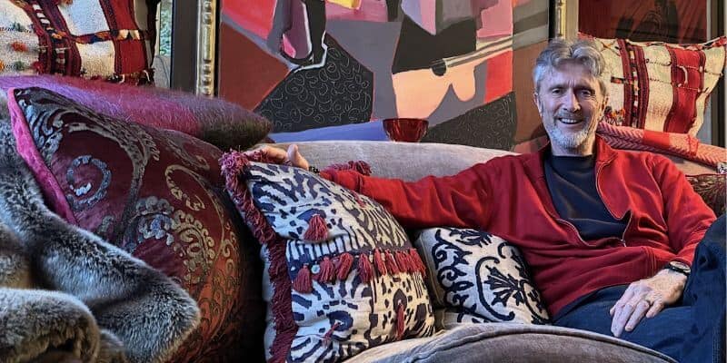
On the Colour Couch with Graphenstone Paint’s Founder, Patrick Folkes
I usually invite creatives and designers onto The Colour Couch, but this time, I wanted to introduce you to someone who works behind the scenes – one of those colour lovers we don’t often get to meet.
Back in 2020, while searching for eco-friendly paints, I came across Graphenstone* and its founder, Patrick Folkes. While he is clearly passionate about colour, he’s also a champion for sustainable, chemical-free paints.
Beyond innovating in the industry, he actively supports community projects like Rise Up Clean Up Margate, where air-purifying murals are used to enhance air quality and raise environmental awareness.
A colour lover with a cause – now that’s someone worth meeting…
What is your earliest colour memory?
When I was a young lad, I had this wonderful colour box. Plastic tubes each full of a coloured glitter, paper, glue and a brush. The colour of the glitter was mesmorising. It had an almost physical impact on me, I can sense it even today. Reds, Purples, Emerald Greens, Silver… sprinkling them onto the glue, creating little oceans of intense colour.
I’ve been captivated ever since. My Dad used to collect watercolours, beautiful, gentle, but they lacked that energy that you get from oil based colours in art which I so much prefer.
What does colour mean to you?
Colour is life itself isn’t it; it brings vibrancy and depth to our world, evoking emotion and creating connection. In many ways, colour allows us to communicate without words – it’s a language that can instantly transform spaces and the way we feel within them.
Do you have a favourite colour or a colour that you find yourself constantly drawn to? And why?
Red! Deep reds draw me in like a moth. My art often has elements of red, my food – who doesn’t love shiny sweet cherries, and of course clothes.
Red adds energy, warmth and dynamism on even the dullest of grey days. I remember one of my school friends Dad had an old Mercedes, dark grey exterior, burgundy red interior, it had such an impact on me!
Do you have a colour that you least like? And why?
I’m not a fan of intense bright yellows. Not even in nature, where normally everything is of course in harmony for me. So I struggle with that shade. But it’s no bad thing to have one colour you don’t appreciate, since it enhances all the others!
What do you love most about working with colour?
The sheer variety. I love the endless possibilities that colour brings, from setting the mood in a room to defining architectural details.
Working with colour is always evolving – there’s always something new to learn, and our paint projects offer a unique opportunity to witness different shades and combinations. Colour is both personal and universal, which makes it endlessly fascinating to work with.
What do you think your life would be like without colour?
Without colour, life would feel flat wouldn’t it? It would be devoid of the warmth and richness that make our surroundings so engaging.
It’s hard to imagine, really. Colour brings energy and personality to our environments and makes each place feel distinct and meaningful. Admittedly, there are some grey days in the UK where on occasions I do feel like I am actually living in black and white!
Compare that for example to the Costa del Luz, in southern Spain where the light and energy of the area creates a colour impact which is impossible to beat. It positively assaults your senses in the best of ways! I love it down there.
For anyone afraid of colour what would your number one piece of advice be?
Start small. Try incorporating colour in accents or in one part of a room to get a feel for how it interacts with your space and light. Experimenting with samples on a small scale can build confidence and reveal the colours that truly resonate with you.
Which colourful person do you most admire and would love me to interview for the On the Colour Couch series?
A challenge perhaps to secure, but I’d love to see an interview with Rose Uniacke. Her remarkably popular colour range with Graphenstone has grown from 14 shades to 61. Watching her evolve the palette, from the off-whites she’s know for into a kaleidoscope of luxurious, vibrant shades has been a wonderful journey. Rose’s colour for 2025 is this gorgeous rich and warm yellow orange, called Buttercup – it literally makes you smile!
How lucky is Patrick to not only work with colour but to witness, in real time, the creation of something new. The joy of discovering fresh colour possibilities right before your eyes? Now that sounds like a dream job to me. And fingers crossed I can get Rose Uniacke on The Colour Couch. I might need to enlist Patrick’s help on that one!
If you would like to discover more about Patrick Folkes and Graphenstone Paints, head over to their Instagram @graphenstonepaintsuk.
Wishing you a colourful day,
Karenx
* this is not an endorsement or an ad.

SIGN UP FOR MY NEWSLETTER
Get a Free Chapter from The Little Book of Colour
© Karen Haller
Designed by cptcreative.com