On the Colour Couch with artist Roanna Wells
I could think of no better colour lover to start off this series of On the Colour Couch than the British artist who Penguin Life commissioned to design the front cover of my debut book The Little Book of Colour -How to Use the Psychology of Colour to Transform your Life, Roanna Wells.
Here Roanna shares why even though she is drawn to the colourful natural world she favours wearing darker hues…
What does colour mean to you?
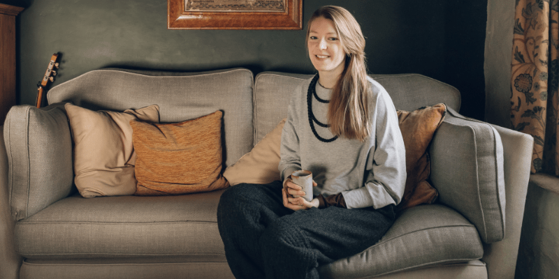
My relationship with colour has changed throughout my life, both in terms of how I wear it and how it features in my work. My mum used to dress me and my sister in really bright colours, but as I have grown, my wardrobe colour palette has honed itself to pretty much black, navy and grey! There are a few hints of mustard and burgundy, but I feel much more comfortable and confident in dark and neutral colours.
My love of colour tends to focus on the natural world and in particular how sunlight reacts with nature. I’ve always been drawn towards the play of light and shadows, and colour patterns such as the markings on rocks or the flash of blue on a Jay’s wing feathers.
Do you have a favourite colour or a colour that you find yourself constantly drawn to? And why?
I’m always drawn towards blues and specifically the gradient of turquoise in water or the verdigris on oxidised copper. In my work I often prefer to use the blue/green/brown/grey end of the colour spectrum rather than the red/orange/yellow end. I’m not quite sure why this is! I find the depth and intensity of deep indigo blues so satisfying and calming, and personally more interesting.
What do you love most about working with colour?
Colour only really started to feature in my work about 5 years ago when I wanted a change from the solely monochrome stitched work I had been doing since my graduation in 2009. I never ventured into using colour with fabric or thread, but when i began experimenting with watercolour paints, I found the subtle blend of tones to be really satisfying. Combined with my love of repetitive mark making, it lead to a whole new series of work which has developed into my current main technique. I have started to become more confident using colour in my work, and the piece I made for The Little Book of Colour was my most bold exploration yet!
I love the way colour can be used so specifically to express mood or feeling, and a subtle change can completely alter an entire piece of work. I’m still exploring this effect, but greatly enjoying the process.
What do you think your life would be like without colour?
I think I would really miss the awe and wonder of magical moments of colour in the natural world – the iridescent green back of a blue bottle fly, the pale powdery shimmer of a Common Blue butterfly, the soft mottled coat of a Dappled Grey horse. But I also like to think that I’d be able to appreciate depth, texture, contrast and variety of a monochrome world – it is said that if one of your senses is lost, then another strengthens in it’s place, so I’d hope that eventually there would be as much variety in black & white as there are in all the colours. I mean, in terms of paper, there are hundreds of shades of white and some look pink, some blue and some yellow!
Were you ever afraid or wary of colour? And what did you do to overcome this?
I think for ages I almost avoided colour outright, partly because I was so happy with the black and white aesthetic, but also because I never really knew how to use colour in my work. As I began to experiment and discover new combinations, my confidence grew. I’ll always love the graphic simplicity of monochrome, especially with embroidery techniques, but I can’t imagine only creating painted work in monochrome now. I feel like I will always have an element of colour in my work, whether subtle and calming, or more bold and energetic tones. I’ve had commissions over the last few years, including the cover work for this book, that have requested a bold colour palette, and to begin with these have sometimes been a challenge, but it has also encouraged me to work outside my comfort zone in new ways and has ultimately led to a greater confidence with colour.
For anyone afraid of colour what would your number 1 piece of advice be?
Start where you feel comfortable and gradually try new colours. Also, colour doesn’t have to be bold, obvious and bright, colour is equally as effective with subtle tones and neutrals. And if wearing black makes you feel confident, then it’s as much a colour as any other I believe!
Do you have a favourite colour place that you visit (or have visited)?
One of my favourite artists is James Turrell, who’s work is prominently concerned with light and space, both natural and artificial and sometimes the combination of the two. His ‘skyscape’ installations – personally the one in the Deer Shelter at the Yorkshire Sculpture Park – are incredibly simple – a room or space with an open window to the sky above, and they allow the viewer to sit and notice the tiny subtle changes in colour of the sky across minutes, hours and even days and through seasons, simply by the way the edges of the space create a natural framing and contrast for the sky. His artificial light installations are equally as absorbing, consisting of immersive and encompassing floods of colour. Well worth a visit if there is an exhibition or installation near you, I could sit with his work for hours!
I’m so pleased that Roanna worked outside her comfort zone, challenged herself with colours she didn’t typically work with to create a colourful book cover image for my book.
If you would like to discover more about Roanna’s colourful world and her work, you can find her over on Instagram @roannawells sharing her colourful musings.

SIGN UP FOR MY NEWSLETTER
Get a Free Chapter from The Little Book of Colour
© Karen Haller
Designed by cptcreative.com