On the Colour Couch with artist/architect Kuda Mushangi
If you love when art and architecture collide, you’ll want to know the name Kuda Mushangi.
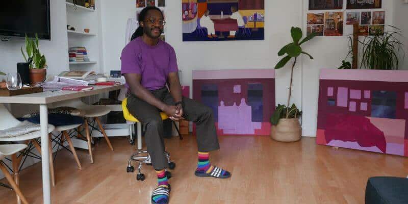
As both a full-time architect and artist, Kuda brings a sharp eye for detail and a strong sense of form to each. His work explores the connections between place, memory and identity, often expressed through abstract forms and colour.
He was shortlisted for this year’s East London Art Prize and his paintings were featured at the London Design Festival last year.
We first met as judges for the CIDA awards this year. It was a joy to spend the day with Kuda, and I was intrigued as it’s the first time I’ve met an architect who is also an artist.
Alongside my usual Colour Couch questions, I was curious to hear how he balances these two practices, where he draws inspiration from, and how colour plays a part in both.
Let’s dive in…
What is your earliest colour memory?
My grandmother’s house from my early years in Zimbabwe (where I was born). It was such a fun and expressive home, bursting with colours on the walls. The whole house was a journey through different shades. The verandah was burgundy, the bedrooms were teal, and my grandmother’s room was purple.
I wasn’t a fan of how overpowering the teal felt at the time, but as I’ve grown older, I’ve really come to appreciate it. I still associate each space with its colour and vice versa.
Whenever I see a particular shade of teal, it instantly reminds me of my room at my grandmother’s house. It’s probably also why I love the colour purple so much; it reminds me of her room, and it’s the colour I most associate with my childhood.
What does colour mean to you?
For me, colour grounds everything in my life. From my art and design work to the clothes I wear. It’s how I express myself, and when it’s used with a bit of confidence, it can be incredibly powerful.
In architecture, colour can carry the narrative of a building, from the material palette in the concrete to the frames of the windows. It’s a way to nod to past architectural elements and the history of a site.
Colour also has a functional use and can be a powerful mechanism in an urban context. For me, great architects embrace colour rather than shy away from it.
I look at some of my favourite architects such as Michael Wilford and James Stirling who boldly put colour at the forefront of their designs, both internally and externally. When colour is used with confidence, it demonstrates a wonderful design flair that can elevate the architecture beautifully.
In my artwork, colour is always where I begin. It shapes the way I see things and helps me capture a feeling or mood before anything else. Every idea starts with colour. It gives me direction and sets the tone for whatever story I’m trying to tell.
Do you have a favourite colour or a colour that you find yourself constantly drawn to? And why?
Easy, it’s mustard yellow. I have bold yellow glasses! They instantly brighten my face and make me feel a little happier every time I put them on. I always try to wear mustard yellow whenever I can. I love colourful clothes in general, but the yellow glasses are always my base. I plan my outfits around them.
Yellow, for me, is a colour of joy. It’s pure, honest, and true to itself if that makes sense. I associate it with happiness. Interestingly though, I rarely use yellow in my paintings! I struggle to make it work for some reason.
Do you have a least favourite colour?
Possibly a vibrant green. It just doesn’t click with me in paintings. However, I do appreciate darker greens, as they remind me of nature.
When I was in architecture school, all the carpets were this really bright green, and every time I see that shade now, it takes me straight back to those stressful late nights in the studio.
What do you love most about working with colour?
I love the endless possibilities. There are so many combinations and compositions that can be created with just a few colours. I’m constantly inspired by how innovative people are in their use of colour. It blows my mind every time.
As an architect, I love the versatility of colour in design and how there’s always an opportunity to create a distinct dialogue between different tones. Sometimes a colour theme in a project can begin on the exterior and continue throughout into the minutiae of the interior design. It’s beautiful when this happens.
Working on a colour theory workshop earlier this year with a leading paint and coatings brand really opened my eyes to how they constantly reassess and reimagine how colour is used in our everyday lives.
You’re both an architect and an artist. How do these two disciplines influence each other, particularly in how you use and think about colour?
Admittedly, I’ve always thought of them as two separate practices until recently. I used to appreciate them independently, but I’ve come to realise how interconnected they truly are.
Many contemporary architectural projects borrow theories and principles from art, allowing colour to serve both a functional and aesthetic purpose while creating distinctive patterns.
A brilliant example is The Laszlo by Henley Halebrown Architects, which draws inspiration from Josef Albers’s colour studies for the doors, frames, and fixings within the building. It’s a great example of how architects can integrate colour theory into a building’s design.
What do you think your life would be like without colour?
Colour is completely integral to my art and design work. It sits above all. It’s hard to imagine how I’d create or communicate my ideas without it. Colour allows me to express complex emotions and ideas in my work, and without it, that would be incredibly difficult.
Colour is so ingrained in the way we live and in how I live that I often take it for granted. It shapes the world and our experiences within it. We instinctively seek certain colours without even realising it.
What’s your favourite colour story?
I love the story of Van Gogh’s yellows. How they were once bright and lemony but darkened over time. There’s something beautiful yet sad about that. It’s a little reminder that even colour has its own mortality. It reminds me that nothing in art stands still; it keeps changing, just like we do.
Were you ever afraid or wary of colour? And what did you do to overcome this?
I definitely was, both in art and architecture.
As architects, it’s quite common to ‘play it safe’ with colour, often leaving it to the specialists within the team. Admittedly, this is sometimes due to the time pressures of a project, which can create a knowledge gap in understanding how colour works and why some combinations are more successful than others.
Colour can be a complex field, and with architecture requiring so much juggling and coordination, it’s often seen as something secondary, leading to a lack of appreciation and understanding.
It wasn’t until I began studying colour theory and using a colour wheel (which I still refer to today) that things started to make sense. I began to understand why certain colours ‘worked’ — whether in a painting or within a material palette for an architectural design.
I remember one day sitting down and asking myself honestly, “How much do I actually know about colour?” The answer was – not much. I’d never studied fine art, so I started watching hours of videos and documentaries about colour theory, taking notes as I went.
That was a key moment for me. It opened my eyes to just how much there is to learn. Once I started combining instinct with theory, my appreciation for how architects have integrated colour into their work grew immensely, and my own work, both in art and architecture improved dramatically.
What was once purely instinctive became grounded in knowledge, and that balance continues to shape my practice today
Do you have a favourite colourful place you’ve visited?
I recently went to the Do Ho Suh exhibition at Tate Modern, where he recreated spaces reminiscent of his dream home using colourful mesh structures arranged in a long, corridor-like installation. It’s a wonderful combination of colour and architecture.
It’s completely immersive, and his play with colour and scale is brilliant. I found it fascinating to notice which areas felt comforting and which felt overwhelming, almost as if the colour itself was shifting the emotional atmosphere of the space.
I’d also have to say the Clore Gallery at Tate Britain by James Stirling. It’s such a joy to visit and experience how architecture and colour can work with one another both internally and externally. It’s one of my favourite projects. The use of colour is at the forefront of the design, and Stirling clearly found joy in embracing colour’s usability in architecture.
If you could pick any colour and name it, what would it be?
During the colour theory workshop I mentioned earlier, I explored how I use colour in my paintings. I experimented with colour mixing and created my own purple, the same hue that often appears throughout my work.
I called it Nostalgic Velvet, as much of my artwork centres on memory, nostalgia, and storytelling. It took a few iterations (both the colour and the name!), but I’m really happy with both.
For anyone afraid of colour what would your number 1 piece of advice be?
Find joy in playing and experimenting with colour. It’s so important. I love discovering weird and wonderful combinations in my work – it keeps things exciting. Of course, it doesn’t always work, but the process of experimenting can lead to unexpected and beautiful results.
I’m still learning about colour and will continue to do so throughout my career. It’s constantly evolving, and that’s what fascinates me most. We never truly know how colour will continue to shape the world we live in, or the one we’re yet to create.
For architects, I’d suggest leaning into its functional and practical uses. Colour can be a key feature for wayfinding and orientation, and in an urban context, bold use of colour can offer a visual anchor or point of reference within the city. If embraced and integrated with functionality, colour can be one of architecture’s greatest assets.
Which colourful person do you most admire and would love me to interview for the On the Colour Couch series?
Yinka Ilori. He’s a brilliant artist and designer whose bold use of colour really inspires me. I admire how he applies it on a large scale, and how his colour palette is instantly recognisable across all his work.
Well, wasn’t that just brilliant? I’ve met lots of architects over the years, but never one who’s also an artist. What a combination. You can see how both disciplines benefit from the other. Structure and creativity working hand in hand, with colour woven through them both. And Nostalgic Velvet, what a name. Such a strong reminder of how our early experiences stay with us.
If you would like to discover more about Kuda, head over to his instagram account @kuda.mushangi.
Tate modern exhibition….
And if you would love some help to reignite your colour confidence, you can download the first chapter of my book – The Little Book of Colour for free.
Wishing you a colourful day,
Karenx

SIGN UP FOR MY NEWSLETTER
Get a Free Chapter from The Little Book of Colour
© Karen Haller
Designed by cptcreative.com