Pantone Viva Magenta. Is it red or pink?
Are we influenced by the colour name we read or the colour we see?
When I met with my publishers about my book, one of the team pulled out a swatch of colour to discuss. We all saw a different colour. I saw a light aqua green. One saw it as a light blue, and another described it as a turquoise.
This is colour perception. We can all look at the same colour sample but perceive it differently through:
- the label each of us gives a colour can depend on our experience of it (colour name)
- the quality of light shining when we see it
- how often we have seen it, and
- how much we have been exposed to it.
When we read or hear a colour name, do we already form an idea in our mind of what that colour is meant to be? And does that influence us with the colour we are seeing?
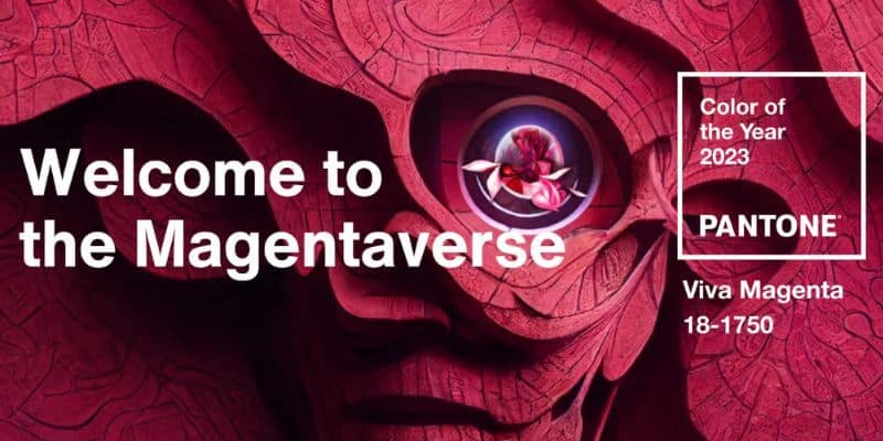
Which brings us to Pantone’s colour of the year for 2023.
Pantone announced Viva Magenta as their colour of the year for 2023 describing it as “a new animated red” but Magenta as a colour is pink, right?
I think Pantone has gone and picked another one of those ‘which is it colours?’. Remember last year’s Ver Peri – is it blue or is it purple? Which was a great marketing coup as it got so many people discussing it. Why not do it again!
With this question in mind, I ran a poll on my Instagram stories, and it looks like the colour lovers of Instagram can’t decide either with pink just ahead of red at 57% to 43%.
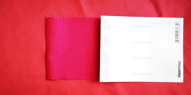
The tricky part is looking at colours on a screen is always going to influence what we see because of how it is calibrated. It’s the age-old golden rule, to always classify a colour in real life. It’s something I recommend to my colour & design students.
So with that in mind, Pantone kindly sent me the colour so that I could see it in real life. I definitely see Viva Magenta as a cool, blue-based pink.
The irony isn’t lost on me here that I’m showing you the pink on a red background with you looking at it on a computer screen. I’m showing it on a red background so that you can see the difference.
So, what do you think it is, a red or a pink? Would you call it Magenta or give it a different name to describe what you’re seeing? Let me know in the comments below.
Wishing you a colourful day!
Karenx
Want to learn more?
Head over to buy The Little Book of Colour where you can find out How to Use the Psychology of Colour to Transform your Life.
If you would like to stay in touch with what I’m up to in our colourful world, then join my mailing list to receive your monthly dose of colourful news.
You can also download the First Chapter of The Little Book of Colour for free.
Want to find new ways to bring colour into all areas of your life? Then The Colour Club might be just what you’re looking for. You can also find me over on Instagram sharing colourful insights, stories and inspiration
Source:
https://www.pantone.com/color-of-the-year-2023
https://www.pantone.com/color-of-the-year-2023-collaborations
6 Comments
Leave a Reply Cancel Reply

SIGN UP FOR MY NEWSLETTER
Get a Free Chapter from The Little Book of Colour
© Karen Haller
Designed by cptcreative.com
Definitely pink but I can see where the debate can had for it appearing red. there are so many variables to consider! Also on this note i think it’s time for me to finally purchase my own Little Book of Colour.
Interior Stylist,
Bonnie x
Hi Bonnie,
You’re right. There are a lot of variables to consider. In natural daylight holding the colour swatch in my hand, my eyes see pink.
How wonderful you’re going to buy your copy of The Little Book of Colour – enjoy the colourful journey!
Karenx
Pink! Or not magenta 😄
Hi Mireille,
You see pink too 🙂
Do you not classify the colour name magenta as a pink?
Karenx
From what I’ve “seen” (PCU hexcode and online) so far, it looks like Barn Red to me.
Hi Anne,
Looking at colour online can be tricky as your device’s calibration is likely to affect the colour you see. If you can get an actual sample that’s the way to go.
Karenx