On the Colour Couch with Garden Designer, Lee Burkhill
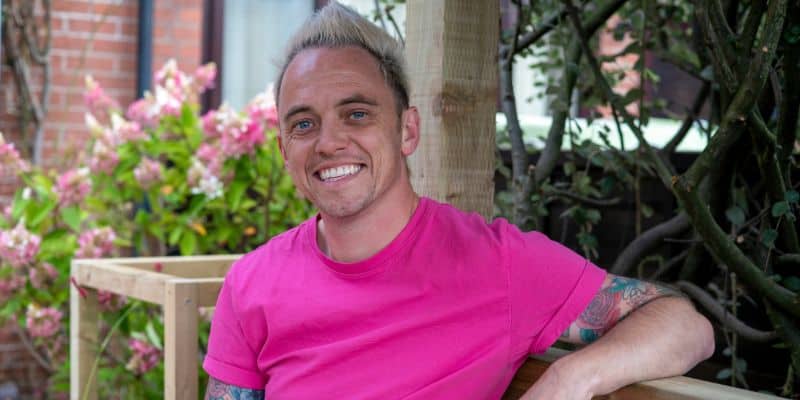
I’m really excited to share this Colour Couch interview with you because it’s a bit of a first for me. My very first gardener. And not just any gardener. I’d say the UK’s most colourful. Award winning Lee Burkhill, the creative mind behind Garden Ninja designs.
If he looks familiar, you might be like me and absolutely love Garden Rescue on BBC1. It’s one of my guilty pleasures. I binge the episodes when a new series comes out and I’m hooked.
Just below the video, you’ll find the full article where I’ve shared all the Colour Couch questions, plus a few extras I couldn’t resist asking.
And if you want to dig a little deeper, in the video we chat about what really goes on behind the scenes. We talk about the show’s format, what it’s actually trying to do, and how those TV makeover shows and glossy social media posts can make things look far easier than they are. There’s also plenty of colour talk, design schemes, and a few light-hearted moments too. Including the bit where I got Lee’s name wrong. You’ll see. Enjoy…!

Read The Colour Couch Interview
What is your earliest colour memory?
It’s going sound a bit weird, but my one of the earliest colour memories I have is that my nana had these four sets of the old-fashioned Tupperware cups. She must have bought them in the sixties or seventies. And it was when all those sort of like mustard, khaki, brown, petrol blue steel colours were in, and there was a green, a brown, a burnt orange and this slight sort of milky steely blue, and they all clipped together.
And whenever we went out in the car or went out for days out, my nana would have these Tupperware mugs and the flask of coffee.
I always looked at them because they were all different colours whereas everything else in my nan’s house and my house growing up, in the kitchen or the lounge, everything would be similar colours. Cushions on the sofa would all be the same colour. Cups in the kitchen would be the same colour. Plates would all be matching, whereas these cups were all the different. And I always just remember looking at them thinking, oh, just look at how if you change them around, you get different combinations of colour.
And, obviously, I didn’t realise it as a kid, I just thought these looked quite fun. But as I’ve grown as a designer, I keep thinking back to that earliest moment of contrasting colour and seeing how colours look as a pair, as in threes.
What does colour mean to you now?
That’s a really good question. I suppose you know instantly whether you like it or dislike it. You look at something, and you either go, that’s alright, or I’m not sure. And you see people picking clothes or picking paint in DIY stores, and they zoom in on one certain colour.
People tend not to jump around the colour wheel too much. But for me, colour is really exciting because it can change your mood, and especially with plants. Because in a garden you might have thirty, forty different species and you can play with the colour wheel to not only utilise gorgeous plants, but give a feel even before you’ve smelled them, seen them, touched them.
And it’s that emotion of using colour, to lift you up, to calm you down. If you’re feeling sad, certain colours might make you feel a little bit less lonely. And a lot of it is subconscious, and I don’t think a lot of people really pay too much attention. They just go, I like that, I don’t like that. But they never scratch away and say, well, why? Or give it an adjective to describe it.
I asked a client why do you love pink? They say Oh, I just do it.
I want them to scratch away – what is it? They say Oh, well, I remember going to the fun fair when I was six. It was a best day in life.
Right, now we’ve got it. That’s why you like pink.
So for me, scratch away a little bit and find out why it makes you feel that way.
Do you have a favourite colour now? Is there a colour that you feel you gravitate more towards?
I’ve got two. The main colour that I love, but I will never wear it because it doesn’t suit me at all, is vibrant orange. Burn your eyes out, Seville orange.
A lot of people, especially in the garden world, will turn their nose up at orange and they just shy away from it. It’s too bold. It’s too brash. They don’t know what to do with it.
But for me, orange it has that warmth. I think it’s a heavy colour, as in it’s not a colour that you can make translucent very easily without it turning into a pastel.
And I just love the fact that it’s so bright and in your face and it commands your attention.
Whereas sometimes we’d say, that the pink and red part of the colour wheel or especially purple leading into indigo, they can quite easily settle in a garden, especially amongst green, whereas orange, you stick orange against black, wow, it just pops out. It contrasts against blue and purple.
In my first house I bought, I painted my entire office bright orange – that burn your eyes out orange, because I thought when I’m in there working or studying or whatever, I want this to be such a step change to the rest of the house. I don’t want this to be relaxing. I don’t want to feel like I could just fall asleep. I want feel like I’ve had three shots of espresso!
Lee shares his approach to using orange in his garden designs
People have commented on my designs, especially with show gardens, that I love what we call the ‘hot colour’ planting palette. A lot of designers like pinks, purples, or blues with a little bit of white, bit of yellow, whereas I love the analogous colours – yellow, orange, red to really vibe up a garden. Not everywhere, but there’s always a hotbed that I will put somewhere where I think this is the exciting part of the garden. I want you to feel lively. If I want you to feel relaxed, I won’t do that. I will put you somewhere a bit calmer, a bit more monochromatic.
But more often than not, I will find somewhere where I can go, this is either really hot or we’ve got a dynamic contrast between orange and blue or yellow and purple. And I want you to feel like something’s happening.
So orange is my absolute favourite colour in the world. However, blue is probably my preference for clothing. And if I want to feel calm, blue’s the colour.
What do you think your life would be like without colour?
Oh it’s easy to say that it would be really dull. I’d like to answer this in a different way and that is a lot of people know what colours they like but don’t really understand why. Then they look to what’s fashionable, or what’s on trend and what am I being sold at the moment. And people repeat those choices because they feel safe with them. Someone has come up with this colour selection, so if I go with it, it’ll work for me. That to me is almost the same as saying, well, I don’t really have any control over the colours of my interiors or garden or car or clothes.
So for me, colour is really important. Without it, it removes some of my agency and choice and how I feel and how I like to present myself. And, you know, I’m anti-conformist I suppose you’d say. Someone that has always danced to the beat of their own drum. And for me, colour is important because it allows me to carry on choosing who I am, how I want to feel. I never look at what’s on trend or what Instagram is serving me or what the magazines say. I don’t have a Pinterest board. I don’t look for inspiration based on what other people are telling me I should do.
I understand the colour wheel. I understand plants. My inspiration is usually what’s the feel that I want? Or this client wants to do this, and how do I use my knowledge to do that? Rather than just going and looking at other people and how have they done it. I want to start from scratch because that’s part of my design process.
Same with, decorating a house, choosing the colour of a car. It’s not what’s the most popular colour. I want to see all the colours and then pick based on how I feel.
So to answer your question, if I couldn’t do that, I’d feel there was a big part of my life that was missing, and I’m not sure I would be able to design as effectively as I do if there wasn’t colour in the mix of the choices I make.
Were you ever scared of colour or afraid of colour, or have you always have you always loved it?
I’ve always loved colour, but I would caveat that by saying, although I loved it, I didn’t always understand it.
Especially with fashion and hair colour. I’ve had blue hair, green hair, pink hair and I look back sometimes and think, oh, that’s a poor choice because it didn’t really suit me, or it didn’t suit that period in my life.
But I knew I loved colour, but until I really learned about design and the colour wheel and how you can blend colours and the emotions of them, when you understand that, suddenly, it’s like, ah, I get it now, and I can make more discerning choices over colour.
And that’s where I think a lot of beginner and intermediate gardeners struggle, is they might understand the plants, they might understand design principles, but then they go to buy the plants or source them and they think of colour and they go, well, I’ll have a bit of this here and a bit of that, but it’s just guesswork. Rather than if I’m going to have white amongst these colours it’s going to wash them out.
You don’t have to follow the colour wheel, but you certainly don’t have to put contrasting colours next to each other everywhere and totally clash. There needs to be some logic because if not, the subconscious will feel awkward. You don’t want that in any home or garden space. I can’t think of any design I’ve ever done where someone said, I’d love to feel awkward in my garden.
Do you have a favourite place that’s colourful that you’ve visited or that you know of that you’d like to share?
The most obvious, because everyone who visits it says, oh my God, I’ve never seen colour like it, is the Jardin Majorelle in Morocco. The beauty of that garden isn’t just the fact that it’s this really kind of modernist take on colour, but you’ve got this Majorelle blue, this really vibrant saturated blue. You can’t miss it.
I actually did a show garden a couple of years using it because it was so vibrant, and I thought I need the center part of the garden to really pop out. And then you’ve got the contrast with loads of big rectangular ponds, pond plants, tropical planting, and then oranges and yellows.
So you’ve got that dynamic contrast, which for people that haven’t heard of that, dynamic contrast is when one colour makes the opposite colour feel more vibrant. They make each other look brighter than when you look at them separately. And it’s a really clever way to amp up colour in the garden.
So the Garden Majorelle does that really well, and it’s so bold because the rest of Morocco are these earthy colours like brick, terracotta and spice. They’re all in that kind of warm brown, yellow, orange with what could be described as cold with the blue, but because it’s so bright it’s it just completely stands out.
But then in contrast to that you’ve got a garden up in Scotland – Benmore, which is a replica of a Canadian/Chilean garden up in the middle of nowhere in the mountains. And the colour is very limited there, but you’ve got every hue of evergreen green, you’ve got different textures of the leaves of pines, redwoods, the Chilean shrubs, and then little pops of orange, and red, and yellow, and pink that only really come out fleetingly in the summer.
So they two completely opposite colour choices, one is green saturation, and the other one is contrast. But those two, when I’ve been to them, always make me feel. It makes you stop and consider colour.
For anyone afraid of colour what would your number 1 piece of advice be?
My main answer would be do a little bit of research, and let’s not get lost in a rabbit hole – maybe read your book [The Little Book of Colour] or watch my video. It’s only three minutes on the colour wheel, and within a minute, you’ll at least understand, what the colour wheel is and how colours relate. And by understanding that, you can start to then make decisions based on how you want to feel. You don’t need to understand every association but just understanding what the colour wheel is and how you can look at it and go, well, those contrast, those complement, those are tertiary colours. You can kind of work it all out yourself.
But I wouldn’t go small. Once you’ve done that step, I would pick a room in your house or a flower bed that you don’t mind experimenting with. Downstairs toilet, perfect example. It’s a good little room in the house to play with colour.
So do your research to understand the colour wheel and then pick something on a feeling rather than a trend or what the homeware store’s trying to push on you.
And the second thing, and it’s going to be really contentious, is move away from greys and beige. I am so bored of watching people paint everything charcoal grey or beigey, wishy, washy colours just because your neighbour’s done it or because you see it.
You’ve got one life, live it. Can we just stop painting everything grey and calling it a foil. It’s not a foil. It just sucks the life out of other colours, and we don’t need to do it.
It’s a really oppressive colour. Used well and wisely, got no problem with it. I would even go as far as to say if you’re going to paint something in your garden grey, just paint it black because at least it’s really bold, but do it really sparingly. Don’t paint all your fence panels grey and then wonder why your plants look really naff. It’s because you focus to the most oppressive part of the garden.
So, yeah, get away from grey and beige, be bold, and if you don’t like it, paint over it. I’m not saying be wasteful, but certainly do something and have an opinion on whether you loved it or not.
It’s a good talking point when you’ve painted your downstairs toilet lime green because for you it felt exciting, but two years later you go, well, actually, I’ve realised that I prefer blue more than green and thinking I don’t know why I didn’t.
I would rather have that chat with someone explaining why they’ve made a mistake with colour than go, oh, we just did everything beige and gray. I just feel it’s a lost opportunity for some excitement.
For garden design in particular, if you’re unsure about colours for your plants and you want to play it safe and go monochromatic, say everything in shades of pink, take a piece of furniture like a wooden bench, and paint it. Paint it orange or blue that pops out against the pink. You can always paint over it.
When I see the garden and it’s a one hit wonder of pink, I see it and think lovely, but it’s two seconds and I’ve gone. If we choose a bit of furniture or even some wooden posts that have been painted a different colour, which I often do on the show, we can then start to see the association with colour, but it gives you a focal point and something interesting to go look at.
Which colourful person do you most admire and would love me to interview for the On the Colour Couch series?
Ok I’d go for an artist who I have adored for decades. Ken Currie, a Scottish painter /artist who details the struggles of the industrial gritty working classes in his huge paintings. The colour ways he uses are so arresting as they always look like storm clouds forming to me, which is interesting given his paintings are usually of people.
I hope you enjoyed this episode of On the Colour Couch. What a colourful journey that was! And thinking about Jardin Majorelle, I’ve been lucky to go to Morocco a few times and I still haven’t been so it’s at the top of my list for when I go back. Seeing it in pictures is one thing, but being there to smell, see and experience it in real life will be something else.
Lee makes an interesting observation about trends. He notes that we can often go with trending colours because it feels safe, but in doing so, it might be that we are handing over control and lose our own voice. What do you think? Can following trends still be a form of self-expression, or is it time to consciously reclaim our own?
If you would like to discover more about Lee Burkhill, head over to his Instagram @garden_ninja_lee.
You can read find out more about Lee’s gardening courses over here.
Wishing you a colourful day,
Karenx

SIGN UP FOR MY NEWSLETTER
Get a Free Chapter from The Little Book of Colour
© Karen Haller
Designed by cptcreative.com